Friday, 29 August 2014

Making Long Gone Don: Creating an Underworld - part 2


Happy Friday to you all!  Today we present our final post of Long Gone Don month.  We've been celebrating the release of our latest graphic novel adventure with a host of posts looking at the art and story and work behind Book 1: The Monstrous Underworld.

And it's to the Underworld itself we now return.  Last week, in THIS feature we looked at our early processes for designing our latest cartoon Universe.  Today, in our final behind-the-scenes post, we take a further delve into the environments and settings of our epic ongoing adventure, and discover why contrast is so important in comics.

Let's start by taking a look at Corpse City's prison and a large courtyard area. Oh, and a nice big fight ... because ... well ... why not?


You'll notice the use of stone, slate, blue hues and grey; colours that are, in fact, reflected in the uniforms of the City's army, as seen in that great big fight (I knew there was a reason we included it!).  These colours are solid, regal, dependable. The buildings are rooted, they are impervious to change.  Corpse City needed to feel like it was built to withstand an invasion, but it also needed to feel a little self-important.  The buildings are always tall, imposing structures. The designs utilise Renaissance architectural details to make everything that little bit more beautiful and clean than the city's counterpart, the slums.

Speaking of which, let's visit those slums, and specifically take a peek at an exterior and interior shot of The Demon Drink, our heroes headquarters.


We wanted warmth to exude from every corner of this tavern and the library beneath. Lorenzo used wood, straw and soft materials in abundance to make the building feel as inviting as possible.  This is a safe home for Don.  A place he can catch his breath.  In contrast to the cool solidity of Spode's City, the Demon Drink is a reprieve from the madness of the underworld.  But that doesn't stop the odd brawl from breaking out when no one's looking.


Nice. We do love a good dust-up.

We hope you've enjoyed our month of exclusives.  There are more releases on the horizon, and live events and exciting news, so stay tuned for all the fun.

And in the meantime, if you haven't already done so, rush out and buy a copy of LONG GONE DON, the adventure that Forbidden Planet reviewed as:

"The Etherington Brothers when they’re really on form. There’s so much to enjoy in Don, a manic energy ... loads of quick-fire dialogue ... great action, great art..."

Wednesday, 27 August 2014

Long Gone Don Model sheets!

Time for part TEN of Long Gone Don month! Today we're looking at some of the model sheets I created for Lewd, Viktor and Spode!

Lorenzo!


Friday, 22 August 2014

Making Long Gone Don: Creating an Underworld - part 1!


Long Gone Don: The Monstrous Underworld month continues!  Today, a little World Building. Nothing too ambitious then...

Very early in the LGD creative process, Lorenzo and I sat down to discuss what we wanted the land of Broilerdoom to look like, to feel like ... even to smell like.  As with all our books, the adventures of Don and his best friend Castanet had to take place in a living, breathing universe.  The land, though fantastical, needed to be constructed on the solid foundations of a sort of pseudo-reality.  Gravity works the same, buildings stand upright, the citizens have jobs and homes and worries and dreams.  The fact that talking crows and giant worm monsters also live there is almost beside the point; Broilerdoom, and it's capital Corpse City, had to feel like they were entirely possible.

And so, by combining architectural styles from across the world and across the span of human history, Lorenzo got to work. With the heat on his junior alchemy set turned all the way to 'HOT SAUCE', he began to bring the world to life in eye-popping detail.


But architectural style is only one aspect of the creative process.  Colour plays a major part in our design approach, and never more so than in defining the Krapookerville Slums, where our heroes eventually find a home.

We wanted to use a sort of twisted adobe style for the majority of buildings in this sector, reflecting the simple lives of the inhabitants. But their outlook on life is amusing and positive, and so Lorenzo used a vibrant palette, with pinks and yellows and blues. He then peppered the whole design with bright green plant life.


Scale was another important consideration. How big was the city? How many people lived there? Now, we don't like to paint ourselves into a corner, so although we actually feature a map of Corpse City in the first book (see below) we made sure that the scale of the drawing was so small that it left a LOT for us to discover in future adventures!  And then of course there's everything outside the city walls ...


Ripley's organic home (centred above) and the walls separating the slums from the city (directly above) inspire drastically different feelings. One is warm and one cold. One welcoming. One intimidating. This sort of contrast is used throughout our world design process.  It might seem obvious, but for a fictional city to truly work in the mind of a reader, you need to be able to easily differentiate between the realms. It can be as subtle as the choice of curtains in a window or as visceral as piles and piles of skeletons lying about the place, but each area should feel new, distinct and always exciting.

We'll have more soon, when we delve further into the art of world building!

Wednesday, 20 August 2014

36 CASTANETS!

Remember when I showed you how to draw Castanet HERE? well, today is part 8 of Long Gone Don month, and I thought I'd share a few more poses for you to have a go at!

Lorenzo!

Tuesday, 19 August 2014

Thumbs up for Long Gone Don from Comics Review!


A huge thanks to Win Wiacek over at ComicsReview, who just posted a fantastic review of Long Gone Don Book 1: The Monstrous Underworld! The review itself is a thing to behold, so head on over HERE to read it in full and find out just why Mr. Wiacek says Don is "A superb serving of macabre mirth no lovers of daft or dark delights can afford to miss."

Lorenzo! 

Monday, 18 August 2014

How to draw: Long Gone Don!

Part six of Long Gone Don month here, with a How to Draw Don tutorial! Enjoy!
And stay tuned, as I'll be showing some character model sheets from the series later in the week!

Lorenzo!

Friday, 15 August 2014

Making Long Gone Don: Scripting Silliness


Lorenzo and I have been creating comics together for quite a while.  A decade in fact.  That's 3650 days of thinking, talking, sketching, considering, procrastinating, deliberating, delegating, arguing, abandoning, admiring, critiquing, erasing, improving and finally, sometimes, even publishing things like this.


Every creator has a different approach to writing a page, and I've certainly honed my process over the years. As part of our ongoing celebration of the release of Long Gone Don: The Monstrous Underworld, therefore, I thought it might be fun to share my personal workflow. There's LOTS to discuss so let's jump in!

Step 1: PLOT/ACTION BALANCE

Everything starts with the tale. I begin by breaking the comic book into rough chapters, usually 6 pages in length. This is the longest I'll want to stay in any one scene or environment, unless there are some really dramatic changes afoot. The reason for this movement is that our books are between 44-52 pages long, so there's no point hanging about.

I then break the story down further to its page-by-page beats. It's important to know the purpose of each page. Is the reader learning a secret? Are we watching a battle? Is this a tender moment or a funny moment? Will we be changing scene? What is balance between plot and action?

Now, the funny thing about the comic page is that most creators think that action only comes from PHYSICALITY, but Lorenzo and I learned long ago that SPEECH is as effective as any movement. A good outburst from a happy, sad, delusional, furious or deaf character can give the page all the punch it requires. It also helps if you do your own lettering, something I love and have discussed before - HERE.

Step 2: JOKES

With the plot/action balance sorted, I turn to the funnies. Humour is exceptionally important to the books Lorenzo and I make together. That's not to say every joke is a laugh-out-loud hoot, but adding layers of amusement to the story is vital to sustaining the pleasure of our material. Don's world, like Sid and Rivet's and Randall's, is a fully realised universe; one filled with a large number of humorous architectural designs, background details, daft signposts and more. The characters have to be funny but so to does the world itself. Once the story is in place I strive to combine a mixture of comedy elements to the script. Sight gags, puns, allusion, repetitive gags, juxtaposition, slapstick, and good old fashioned JOKES are used where applicable to bring a lightness to the weight of the story.
That said, a good joke does not instantly earn the right to be on the page. A story built around a pun is hard to care about. But when humour serves the story, and helps build/reinforce/reveal character, then it's golden.

Step 3: THUMBNAIL

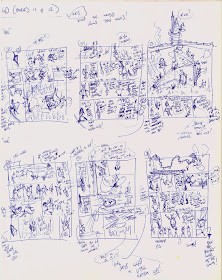
I cannot draw - that is a fact - but I'm pretty good at visualisation, which is something that comes from my love of film and games. I can see a scene play out, but until I've tried to sketch it, I'm never 100% convinced it's going to work. So I thumbnail and thumbnail and thumbnail. With steps 1 and 2 firmly in my head, I break the page into panels and get to work. Here's the resulting mess - a random nine pages from Book 1.


I particularly like the drawing of the Brick-Licker, and that bold note to myself on the right ... GET INTO THE ACTION EARLIER! So true...

This is all rough stuff, but it gives me an idea about the general panel-to-panel movement. With this in place I can move onto the MOST important stage.


Step 4: DIALOGUE

Too many words on every page, generally = bad.
Not enough words on every page, generally = empty.
Those are the basic rules to live by, but once you've mastered that the world of dialogue opens up before you. Unless you're creating a largely narrated comic, you'll need to think about your characters' voices. How do they speak? Do they talk to different characters in a different manner? Do they have an accent? And most importantly - what is the age of the audience for your comic strip?
Taking your time with the dialogue is the difference between a story people want to read, and one they skip. TIP - always deliver your script aloud. This will help to correct most unforced errors.

Step 5: DESCRIPTION / RESEARCH

Once the dialogue is reading well it's time to flesh out the panel descriptions. Lorenzo knows this world extremely well and most of the time I keep the details vague so he can bring his own style to the page. But there are always certain details for which I have a specific design in mind. This is the time when I delve into the research and start pic hunting to make sure Lorenzo has everything he needs to bring the page to life.

For instance, at one stage in Book 1, Don dons (ha) a fancy dress mask that looks like this...


That was based on a 14th/15th century ceremonial Aztec Summacaw tail mask, like this...


These little details all serve a purpose and they're fun to add!
All of which brings us to the end and the final stage...


Step 6: SEND TO EDITOR

...after which I often find myself revisiting Steps 1-5!  HA!  But that's all part of the rich tapestry of creativity.

I hope you've enjoyed this latest peek behind the curtain of our creative process.

To discover how Lorenzo takes my script to the all important ART stage, click HERE!

 More soon!

Thursday, 14 August 2014

Check out these beautiful interpretations of my designs by WARLOCKSS

Talented digital painter Etienne St-Laurent (aka Warlockss) took some of my vehicle concepts and created some incredible coloured designs based on them! Amazing! Top work, Etienne!

Lorenzo!

Wednesday, 13 August 2014

FREE Long Gone Don!


Well, a free four page preview, but who's going to turn their nose up at that, eh?

The Long Gone Don: Monstrous Underworld month continues today with a healthy chunk of the comic itself.  Because that's what this is all about.  Action, plot, giggles and a bit with a crow.  So here for your delectation is the first appearance of key players, Lewd and Safina, and the infamous Demon Drink tavern.

To set the scene, well, Don and best friend Castanet are on the run from the ever inept Slum Guards. Click on the pages (then click on them again in the new window) to see them BIG!


If that TINY taste whetted your appetite then waste not a moment more - buy your copy today in-store, or online via Amazon HERE or the Phoenix comic shop HERE, or a million other places.

And with the fourth book in the series well underway, we feel confident in saying that the grandest undead adventure of all time is only just beginning.  That's an Etherington/Don promise.

More tomorrow!

Tuesday, 12 August 2014

Epic fan art gallery of awesomeness!

Part three of Long Gone Don month is a gallery of some of the awesome art we've received recently from our young fans. I know it's Don month, but there's a Doogan in there too, for good measure! Massive thanks to the amazing young artists behind all this work! Getting pictures from you guys makes us so happy!

Lorenzo!


Monday, 11 August 2014

Long Gone Don cover tutorial!

Part two of Long Gone Don Month is a step-by-step process of how I drew the cover to the book - enjoy!

Lorenzo!


Thursday, 7 August 2014

Long Gone Don: The Monstrous Underworld - Out NOW!


It's Long Gone Don publication day! HOORAY! HOORAY!


Launching a new comic book is a lot like releasing an animal that's been bred in captivity, back into the wild. As a creator you've grown your comic, nurtured the story, encouraged the characters' early steps, watched it grow, and change shape and size and, pretty soon, develop a life all of its own.

So it was with Malcolm Magic, Monkey Nuts, Baggage, Yore, Doogan, and now Don. Back in May 2011 Lorenzo and I started putting together the first concept work for the cast who would eventually go on to populate the strange land of Broilerdoom. Three years and three adventures serialised in the pages of the mighty Phoenix Comic later, and Lorenzo and I can safely say that our charges have found their feet.

And today you can all enjoy the debut tale of young Don and his best friend, Castanet, as it was intended to be experienced, in our first full length Long Gone Don graphic novel.


Long Gone Don: The Monstrous Underworld is available absolutely everywhere that good books are sold - and if your local book shop, comic shop or library doesn't have it in, just ASK! They can order absolutely ANYTHING, and they need to know that great comic book adventures exist for all ages.

Alternatively you can purchase Long Gone Don online at any number of book-selling sites, including...

The Phoenix Shop - BUY IT HERE
Amazon - BUY IT HERE
WHSmiths - BUY IT HERE
Waterstones - BUY IT HERE

If you have a son, daughter, nephew, niece, cousin, brother, sister, friend or loved one aged 7-70, give them a summer holiday gift of giggles. Trust us, you won't regret it. And if you like what you discover behind that beautiful cover, then please spread the word.

We'll be celebrating Don and his tall tales all month, so stay tuned for LOTS more goodies and treats.

Wednesday, 6 August 2014

Castanet's biggest fan, PLUS how to draw the feathery fellow!

Top Dad Martin tweeted this truly excellent shot of young Long Gone Don fan Katie doing her best Castanet impression to celebrate the free Don poster that came in the Phoenix last week, and we just had to show it to you! Amazing!

And hey, as we're talking of castanet, here's a little guide to how you draw him...!


Oh, and you remember what tomorrow is, right?!

Lorenzo!

Tuesday, 5 August 2014

Monday, 4 August 2014

New Radio interview up NOW!

I was lucky enough to be interviewed on fantastic culture station Ujima Radio recently, and we managed to cover a pretty broad spectrum of topics including gender roles within comics, the Summer Reading Challenge, how the the Marvel Bullpen would make me go mad, racial diversity in comics, Calvin and Hobbes, The Phoenix, and Dan Dare! Phew! You can hear the show for the next month or so HERE, my interview is in two parts, the first starting at 06m:00s, and the second at 22m30s. Enjoy!

Many thanks to Cheryl Morgan for the great chat!

Lorenzo!